Wednesday, 6 September 2017

How to Create the World’s Easiest Mobile Checkout Experience

User experience can make or break your business.

The checkout process is the most crucial element to consider in that regard.

Even more important is the context of that experience.

What’s appropriate for the desktop will not be suitable for the mobile interface.

For the most part, businesses understand this. It’s why there has been a widespread preoccupation with mobile friendliness.

Here’s the thing though.

People often neglect the checkout process.

Your customers make their final purchasing decisions before they get to checkout.

So why bother, right?

That’s being incredibly short-sighted.

Shopping cart abandonment is a real problem for ecommerce stores.

Customers expect their mobile shopping experience to be seamless, easy, and without friction.

If your checkout process does not meet these expectations, your conversion rates will dive, and your revenue will head south.

Considering that more than 50% of ecommerce traffic is mobile, you shouldn’t take it lightly.

twitter mobiletraffic lg jpg 800 800 pixels

In this article, I’ll give you some tested strategies for making your mobile checkout experience as easy as possible.

This way, your customers won’t be impeded by any friction when reaching for their wallets.

Your conversion rates will be higher, and shopping cart abandonment won’t be a dire issue for you.

Let’s start.

1. Enable guest checkout

If I’m mandated to create a user account before I check out, it’s an immediate turn-off.

I don’t know about you, but that’s the consensus.

Sure, you may take the time to create an account when you’re on a desktop.

Otherwise, it’s a hassle, and customers hate it.

Need proof? This is the second most common reason for shopping cart abandonment:

Checkout best practice 101 guest checkout ClickZ

It’s likely that mobile shoppers are using this interface because they’re pressed for time. That’s why it’s important to have an option to check out as a guest.

Here’s an example:

Lulus Login

I understand there are many benefits to increasing your user base.

You’ll have:

  • more demographic data to tailor your marketing to your customers;
  • a better chance of increasing your customer lifetime value because subsequent purchases will be easier;
  • the means to cultivate a strong bond with your customers, leading to more customer advocates.

The advantages are undeniable.

And there is an easy solution.

Provide incentives for shoppers to create an account.

You can reward them with a coupon code or credit towards their next purchase:

Cute Dresses Tops Shoes Jewelry Clothing for Women

Guess what? Most people will jump on that offer.

That’s a much more effective approach than forcing them to create an account.

The encouraging news is, many businesses are catching up to this. Most offer both options.

2. Make it easy to add items to cart and check out

Here’s the deal.

Many people who shop on their mobiles have likely visited your desktop store.

They already know what they want to buy.

They know where on your website it’s located.

The easier it is to find this item, add it to the cart, and locate the checkout, the faster you make the sale.

It’s as simple as that.

Having a “quick view” option right within navigation is an excellent way to put this into practice.

Here’s an example from Lulus:

Screen Shot 2017 08 30 at 11 38 25 AM

If I click on “quick view,” I will not be redirected to a separate page for that particular product.

Instead, a window pops up with an obvious the “add to bag” option.

Black Leather and Lace Up Sneakers at LuLus com

I’m met by another pop up that allows me to check out easily.

All this happens without me having to leave the page I was browsing.

Black Leather and Lace Up Sneakers at LuLus com 1

Convenient, right?

3. Eliminate unnecessary form fields

The less information customers have to fill out during checkout, the faster they get through the process.

It also means they’ll have less resistance.

I highly recommend to include as few form fields as possible to complete the transaction—only the ones you actually need.

Checkout pages usually have both requied and optional fields:

Cute Dresses Trendy Tops Fashion Shoes Juniors Clothing 1

If your checkout process doesn’t suffer without the optional fields, get rid of them.

It’s why many businesses opt for a one-page checkout.

However, I don’t recommend just one page for mobile.

Why?

For one, you have little screen real estate.

It means shoppers have to scroll endlessly to fill out their information. They also have to move back and forth to verify they have no errors.

It’s not the most optimal experience.

A paginated checkout allows you to break the process into bite-sized steps.

This, combined with a progress bar, will make it easier for your customers to compelete the checkout.

Here’s what I mean:

Cute Dresses Trendy Tops Fashion Shoes Juniors Clothing

In the image above, it’s easy to see there are four steps to the checkout process.

Customers know what to expect and remain aware of their progress throughout.

4. Have a mobile-friendly version of your desktop storefront

You may be thinking this is obvious, but let me explain.

There are multiple elements to mobile-friendliness.

I’ve seen mobile storefronts that are vastly different from their desktop versions.

If there’s no alignment between the two interfaces, shoppers will think they’re in the wrong place.

The result? They bounce.

As we’ve seen before, most people first go to the desktop site to browse, get reviews, and make their decisions.

Ensure your mobile store is familiar to those who’ve gone through that process.

The other element of a mobile-friendly checkout is speed.

Shoppers of all kinds—mobile or not—want instant gratification.

They’re not as concerned with buying your product as much as they are with owning it.

If you take that away from them, whether by having a slow site or asking for much information, they’ll walk away.

The desire to own the product doesn’t go away. Your customers will simply go to your competitor. That’s bad for business.

Another important consideration is browsing behavior.

Mobile browsing is unique in many ways.

Here’s how you can optimize the mobile checkout process with user behavior in mind:

  • To navigate, users use their fingers, not a mouse: This means you should place all key elements on your page within reach of the thumb.
  • Typing and clicking are trickier on mobile: You need to have bigger and wider easy-to-click buttons. A larger font size also helps with improving accuracy of text input.
  • Fingers are less precise than a mouse, so the process is more error-prone: It’s crucial you make it easy to detect and correct errors.

Fashion Nova Checkout

Ever made an error when filling out a form and had to enter every single bit of information over again?

It happens all the time, and it’s a significant pain.

5. Have several payment options

If you’ve shopped at a store that only offered one payment option, you know how frustrating this can be.

This is another common reason for cart abandonment. It’s clear your customers want choices, especially when payment is concerned.

According to research, 54% of people feel having a variety of payment options is important when checking out online:

032 jpg 750 381 pixels

That’s not to say you have to give them every possible payment choice, but two or three is the best practice.

Like this:

Your Shopping Cart

The ideal options will depend on your target audience.

For instance, some people loathe PayPal and would never use it.

Others think it’s the most convenient option out there.

I recommend surveying your audience to find out what they prefer.

Note:

There’s a fine line between providing enough payment options and too many.

Having more than three options can get overwhelming, quickly.

It can lead to decision fatigue. And when that happens, users are more comfortable taking no action at all.

You don’t want that.

There is an easy solution to combat decision fatigue when providing several options.

Offer one of the options as the recommended choice and the others as alternatives.

This way, you’ve decided for your customers, but you’re still providing options in case they need them.

6. Set up default billing/shipping address for returning customers

Most people hate filling out this information.

It’s time-consuming and repetitive, especially if you’re a returning customer.

This is necessary info, so people will do it anyway.

But there’s a lot of resistance.

What can you do?

In addition to eliminating unnecessary form fields, you can set up the form so that it auto-fills the information for returning customers.

Email address, name, billing address, and shipping address—all this information can be saved for future purchases.

Some stores use a tool that looks up addresses based on a postal code and auto-fills that info.

Here’s how it works.

You type in a zip code:

Fashion Nova Checkout 2

You’re prompted with a window like this:

Fashion Nova Checkout 1

You’re given address options based on your zip code so you don’t have to fill this yourself:

Fashion Nova Checkout 3

There’s also an address validation tool similar to this one.

When a shopper types in their address, they get asked if it’s the right one and are given other options.

This is useful for a few reasons.

First, it auto-fills with more accurate information.

Secondly, it reassures customers they have the right shipping info. This way, they’re not anxious about missing their shipment due to error.

There’s one thing you need to note.

Address validators aren’t always correct. It means customers should have the option to reject the suggestions and fill in their info themselves.

7. Make navigation easy and distraction-free

Navigation on a mobile device should be as simple as possible.

You know that three-lined navigation button that signifies a menu on a mobile device?

That’s called nested navigation, and it makes things super simple. It makes for a cleaner page and no distractions.

But that alone is not enough.

Here are more tips for simplifying your navigation:

  • have only as many options as you need to avoid decision fatigue and distraction;
  • have short and descriptive labels in your navigation;
  • include a prominently placed search bar;
  • use endless scroll instead of pagination for browsing through products;
  • make it easy to return to the homepage.

These tips are for your mobile ecommerce store.

On checkout pages, there shouldn’t be any navigational elements.

You can include links to resources that shoppers may need to complete the checkout process. For instance, a call or email button is useful if they need help.

Apart from that, I recommend eliminating navigation.

Don’t include advertisements, links, or buttons that do nothing to move the checkout process along.

8. Allow customers to see what’s in their carts as they shop

The whole shopping cart concept is a bit strange.

Think about it.

You browse through products and funnel different items to a page you don’t actually see.

It’s not until the end of the browsing process that you go to your cart to view your items.

Most ecommerce stores do nothing to improve this aspect.

It’s not uncommon for people to forget what they placed in their carts and be surprised by the total price.

Incidentally, these are also common reasons for shopping cart abandonment:

13 Reasons for Shopping Cart Abandonment and How to Fix Them

Based on the responses in the graphic above, here are some suggestions for improving the shopping cart experience:

  • show customers what’s already in their carts every time they add new items;
  • communicate the total price of their items every step of the way;
  • have a “save to cart” feature for those who are not ready to check out;
  • have your own comparison charts against competitors within product pages;
  • list shipping costs as early as possible in the checkout process.

Conclusion

Mobile commerce has improved by many factors over the years.

Despite the progress, you can still do a lot to improve the experience for customers.

The easier and quicker the process is, the higher your conversion rates will be.

That’s a given.

It’s worth noting that every strategy won’t yield the same results for all ecommerce stores.

You need to test the elements of your checkout process to see what works best. That’s the best way to ensure you’re not losing customers where it matters most.

Start with the strategies in this article. Put them to the test, and see what difference they make for your business.

Do you have any other tips for simplifying the mobile checkout experience?


from http://feedproxy.google.com/~r/Quicksprout/~3/prp2ASnTvlk/

source https://kateninablog.tumblr.com/post/165050178039

Tuesday, 5 September 2017

Google Search Console: What the latest updates mean for marketers

Google Search Console has long been a go-to platform for SEOs on a daily basis.

It provides invaluable insight into how people are finding our websites, but also allows us to monitor and resolve any issues Google is having in accessing our content.

Originally known as Google Webmaster Tools, Search Console has benefited from some significant upgrades over the past decade. That said, it is still far from perfect and few would argue that it provides a complete package in its current guise. A raft of industry updates, particularly those affecting mobile rankings, has left Search Console’s list of features in need of an overhaul.

Therefore, Google’s recent announcement of some ongoing and upcoming changes to the platform was very warmly received by the SEO community. These changes go beyond the cosmetic and should help site owners both identify and rectify issues that are affecting their performance. There have also been some tantalizing glimpses of exciting features that may debut before the end of the year.

So, what has changed?

Google categorizes the initial Search Console changes into the following groups: Insights, Workflow, and Feedback Loops.

Within the Insights category, Google’s new feature aims to identify common “root-cause” issues that are hampering the crawling and indexation of pages on a website. These will then be consolidated into tasks, allowing users to monitor progress and see whether any fixes they submit have been recognized by Google.

This should be hugely beneficial for site owners and developers as it will accelerate their progress in fixing the big ticket items in the platform.

analytics

On a broader level, this is in line with Google’s drive to use machine learning technologies to automate some laborious tasks and streamline the amount of time people need to spend to get the most out of their products.

The second area of development is Organizational Workflow which, although not the most glamorous part of an SEO’s work, should bring some benefits that make all of our lives a little easier.

As part of the Search Console update, users will now be able to share ticket items with various team members within the platform. Given how many people are typically involved in identifying and rectifying technical SEO issues, often based in different teams or even territories, this change should have a direct and positive impact on SEO work streams.

Historically, these workflows have existed in other software packages in parallel to what occurs directly within Search Console, so bringing everything within the platform is a logical progression.

The third announcement pertains to Feedback Loops and aims to tackle a longstanding frustration with Search Console. It can be difficult to get everyone on board with making technical fixes, but the time lag we experience in verifying whether the change was effective makes this all the more difficult. If the change does not work, it takes days to realize this and we have to go back to the drawing board.

feedback

This lag is caused by the fact that Google has historically needed to re-crawl a site before any updates to the source code are taken into account. Though this will remain true in terms of affecting performance, site owners will at least be able to see an instant preview of whether their changes will work or not.

Feedback is also provided on the proposed code changes, so developers can iterate very quickly and adjust the details until the issue is resolved.

All of the above upgrades will help bring SEO to the center of business discussions and allow teams to work together quickly to improve organic search performance.

In addition to these confirmed changes, Google has also announced some interesting BETA features that will be rolled out to a wider audience if they are received positively.

New BETA features

Google has announced two features that will be tested within a small set of users: Index Coverage report and AMP fixing flow.

The screenshot below shows how the Index Coverage report will look and demonstrates Google’s dedication to providing a more intuitive interface in Search Console.

Google_Search_Console_New

As Google summarized in their announcement of this new report:

“The new Index Coverage report shows the count of indexed pages, information about why some pages could not be indexed, along with example pages and tips on how to fix indexing issues. It also enables a simple sitemap submission flow, and the capability to filter all Index Coverage data to any of the submitted sitemaps.”

Once more, we see the objective of going beyond simply displaying information to go to a deeper level and explain why these issues occur. The final, most challenging step, is to automate the prescription of advice to resolve the issues.

Other platforms have stepped into this arena in the past, with mixed success. SEO is dependent on so many other contingent factors that hard and fast rules tend not to be applicable in most circumstances. Automated advice can therefore either be too vague to be of any direct use, or it can provide specific advice that is inapplicable to the site in question.

Technical SEO is more receptive to black and white rules than other industry disciplines, however, so there is cause for optimism with this new Google update.

The second BETA feature is the AMP fixing flow. AMP (Accelerated Mobile Pages) is Google’s open source initiative to improve mobile page loading speeds by using a stripped-back version of HTML code.

With the weight of one of the world’s biggest companies behind it, AMP has taken hold with an increasing number of industries and looks set to widen its reach soon within both ecommerce and news publishers.

Google has bet on AMP to see off threats from the likes of Facebook and Snapchat, so it stands to reason that they want to help webmasters get the most out of its features. Any new coding initiative will bring with it a new set of challenges too, and some developers will find a few kinks as they translate their content to AMP HTML.

The AMP fixing flow will look similar to the screenshot below and will allow users to identify and tackle any anomalies in their code, before receiving instant verification from Google on whether the proposed fix is sufficient.

What’s next?

The one aspect of Search Console that all marketers would love to see upgraded is the lag in data processing time. As it stands, the data is typically 48 hours behind, leading to some agonizing waits as marketers hope to analyze performance on a search query level. Compared to the real-time data in many other platforms, including Google Analytics and AdWords, Search Console requires two days to source and process its data from a variety of sources.

That may change someday, however. As reported on SE Roundtable, Google’s John Mueller has stated that they are investigating ways to speed up the data processing. Although Mueller added, “Across the board, we probably at least have a one-day delay in there to make sure that we can process all of the data on time”, this still hints at a very positive development for SEO.

With so many changes focused on speed and efficiency, a significant decrease in the data lag time on Search Console would cap this round of upgrades off very nicely.


from https://searchenginewatch.com/2017/09/05/google-search-console-what-the-latest-updates-mean-for-marketers/

source https://kateninablog.tumblr.com/post/165028743219

Monday, 4 September 2017

How to optimize featured snippets for voice search

SEO is an exceptionally fast-paced industry, and sometimes keeping on top of the latest updates and imminent changes can be a full-time job in itself.

One factor that is having an unprecedented effect on organic search is voice search. The combination of an increase in mobile searches and the rise in voice assistants has meant that the way in which people are searching for information online is changing dramatically.

Whether it’s Siri, Cortana, Amazon Echo, Google, or another robot friend, there is no questioning the importance of voice search. According to Google, more than half of queries will be voice search by 2020, and this requires a refreshed approach to SEO.

Featured snippets

One of the key aspects of this is featured snippets, as these are the results which are read aloud in response to voice searches. Featured snippets are often referred to as ‘Position Zero’, a phrase coined by Pete Meyers. They are the direct answer results that appear at the top of the SERPs in a box, and they often include a link back to the source of the answer.

Source: Stone Temple

According to Stone Temple Consulting, nearly 30% of 1.4 million Google queries tested now show Featured Snippets. That’s a lot of affected searches. Updating your search strategy to include optimization for featured snippets should therefore be a priority.

The key point to remember with featured snippets is that if a searcher is using voice search and expecting a verbal reply, they will not be presented with a choice of results. Instead, only one result is read out and where there is a featured snippet, this will be the choice of the voice assistant.

You could have the most mind-blowing and enticing meta description and title tags in the world, but if you’re not in that sought after position zero, then your lovingly crafted content will not be read aloud and will therefore remain both unseen and unheard by the searcher.

Long-tail keywords

Of course the key difference between voice search and standard search is the use of more natural, conversational language. This new style of search and query formats must be factored into your strategy. Cue long-tail keywords!

The first step in your journey to the exclusive realm of featured snippets is to identify the informational queries related to your product or services. Use keyword tools, but also ask customers and consider the frequently asked questions you receive on a regular basis.

Answer the Public is a fantastic tool for these more conversational search queries. The tool allows you to dig deeper into user intent by separating the results into question starters, such as ‘who’, ‘why’ and ‘how’. Build on this research by uncovering other similar queries, using the ‘People also asked’ feature on Google.

Test the questions that you generate by typing them into Google and analyzing the results of the featured snippets. Use these as a basis, but work out what you could add or improve on to make the result even better. Perhaps the article source does not provide much further information, or perhaps the current answer displaying isn’t long enough.

Optimizing content

The next step is to write a response to these questions, which is likely to be in the form of a blog post. Sure, Google only shows a small percentage of the text from an article in the featured snippet, but this does not mean that your article should only answer the question directly.

Include a direct response, but expand on this further in the article and provide depth. We all know that Google loves depth of information and given that featured snippets provide the option to click through to the source, you need to be offering additional information that could be of use to the reader.

Adopt the formula of answering the question directly and then follow it up by covering other related search queries. This should help you cover all the bases and achieve that coveted spot. Ultimately, you may need to do a bit of testing and reiterating to see what works best.

It is also worth integrating more Q&A style formats into your content. These do not have to just be limited to an FAQ page and it is worth revisiting how you can optimize some of your content to fit this Q&A style. The easier you can make it for Google to pull the featured snippet from your content, the more likely you are to appear in that prized position zero and therefore benefit from voice search as well.

More than a third of featured snippets and knowledge boxes contain an image, so another tactic to experiment with is to utilize different formats, such as tables or graphs. Try using numbered points to break up the content into simple steps, as this helps to optimize the content for voice search.

Plus, if there are too many steps to display in the featured snippet, then Google will include a read more button that links through to your website, which can be an effective way of converting people from voice search into website traffic.

Local searches

Voice search is characterized by its prevalence on mobile devices and its focus on local searches. This is of paramount importance to local search strategies, especially given that 50% of mobile visitors who perform a local search will visit a store within one day.

Although these may not bring up featured snippets, they do reveal the Google My Business profiles, which can be read aloud as directions. In fact, directions are one of the most popular queries for voice search, unsurprising given the push towards hands free, particularly when driving.

Source: Google Official Blog

As far as local searches go, you need to make sure that all of your contact information is as accessible as possible on your site. Make Google’s life easy when it comes to crawling your site; you’ll be more likely to feature high up in the featured results and therefore be the winner of the voice search game. Ensure your contact information isn’t simply within an image or this will certainly damage your chances of appearing.

You know what else you can do to make the Google bots even happier? Schema markup – it will significantly increase the chances of obtaining a featured snippet.

It goes without saying that you need to keep your Google My Business up to date. Again, this should be part of your SEO efforts anyway, so no sweat there. Once your contact information is updated and where it should be, help the process along by submitting a sitemap to Google. Also submit any new content that you add to your site, just to speed up the process.

Mobile ready

Don’t forget to focus on mobile. Given that the vast majority of voice searches occur on mobile, it is essential that the mobile version of your site is fully optimized.

I know what you’re thinking: but voice search entails that only the featured snippet will be read aloud, so what’s the point of a fancy pants mobile friendly website? Well, Google likes fancy pants mobile friendly websites, that’s why. Don’t believe me? Riddle me this – why are they moving to a mobile-first index?

Even using voice search, there is always the chance that the user decides to delve into their query further to read more. In which case they’ll head straight to your site, and if it’s not delivering in terms of user experience then you won’t be staying in that top spot for long.

Conclusion: User intent is key

When it comes to trying to get that valuable featured snippet place, there is no special technique that is any different to standard SEO. In short, if you are thinking carefully about user intent then you should be fine.

Given the recent updates like Hummingbird and Rankbrain, user intent should already be a priority in your search strategy. So if you’re doing this then your content should already be optimized for featured snippets and voice search.

Using voice search for commercial intent is only in its infancy at the moment. However, we are only expecting this to evolve and develop over time as people become more and more comfortable with voice search.

So you’d best be ready!


from https://searchenginewatch.com/2017/09/04/how-to-optimize-featured-snippets-for-voice-search/

source https://kateninablog.tumblr.com/post/164973270349

Saturday, 2 September 2017

How to Incorporate Social Proof on Every Page of Your Website

Every online marketer knows that the Internet is an insanely skeptical place.

It’s with good reason.

Let’s be honest.

Our space is littered with faux gurus and hyped up promises.

You’ve seen them:

“Make $500 000 with your first online course launch.”

“Give me 15 minutes, and I’ll give you a profit generating machine!”

Okay, I’m exaggerating a bit, but you get the drift. Your prospects don’t know you well, and they don’t trust you yet.

Social proof can change that.

Think about the last time you bought a product without looking at the reviews first or without a recommendation from someone you know.

Never happened, right?

That should give you an idea of how integral social proof is to easing the minds of your customers.

There is one question I get asked a lot.

People want to know where on their websites they should display proof elements.

The answer?

Everywhere.

Social proof should be splattered across your website.

The key is to have the right kind of proof on the right pages.

In this post, I’ll describe different types of social proof you can use and where on your website you can display them for maximum effect.

Sound good? Let’s start.

What is social proof?

Do you know what the herd mentality is?

It describes the way people are influenced by their peers to behave in a certain manner.

That’s the basis of social proof.

You see a bunch of people doing the same thing. You assume it’s the right thing to do. You do it too.

Now, it’s way more comforting to believe we are all independent thinkers and we take actions on our own volition.

Not true.

Of course, the pack mentality doesn’t apply to every area of life.

In business, however, you can bet it’s always at play.

And that’s good news.

It means you have the methods to ease your prospects’ anxieties and push them to make that final purchase decision.

Best of all, social proof makes your customers feel confident about their decisions.

Here’s the thing though.

Not all proof elements are created equal.

Some are more persuasive and impactful than others. Even the placement of that proof can have an impact.

I’ll give you the most compelling types and ways you can incorporate them so you have proof elements on every single page.

1. Case studies

This is by far one of the most powerful types of social proof.

Why?

It tells a complete story (if done well).

And as you know, a success story is the best kind of story in this case.

With case studies, you get a holistic view of your customer’s journey. You get to learn:

  • what their life was like before they invested in you
  • what prompted the purchase decision
  • the obstacles they had on their way to a better outcome
  • how you helped them overcome these obstacles
  • the exact moment they experienced transformation
  • what life looks like in the aftermath of this transformation.

Does your case study need all these elements?

Yes.

It’s way more effective than simply having a customer say

I had a great experience working with Jane, and I highly recommend her.

There is a place for that kind of proof, and I’ll talk about that later.

Where should you display case studies?

They’re so powerful they can stand on their own. I always recommend having a separate page to feature your success stories.

Like this:

How to Add Social Proof to Your Website 12 Examples 2

Here’s another example:

Stories Your Hot Copy

Ramit Sethi executes this kind of social proof perfectly in his GrowthLab:

Success Stories GrowthLab

While you can have these on a separate page, you should also include product- or service-specific case studies on your sales pages.

You can do it in a number of ways:

  • strategically embed video case studies into your sales page;
  • use case studies as a response to questions on your FAQ page;
  • condense the success story into a testimonial and have a “read more” link so prospects can access the full case study from your sales page.

These are just a few ideas.

2. Customer testimonials

These are much easier to put together than case studies.

Simply ask people with whom you’ve worked (and have had success) to write you a testimonial.

Like this:

Brand Story Breakthrough StorySuasion Formula

Unlike with case studies, I don’t recommend you hoard all your testimonials on one page.

Why?

A testimonial doesn’t tell a whole story.

That means it won’t have much impact standing on its own. It needs to be backed by something else.

Here are some ideas for placement:

  • next to a contact form
  • next to a call-to-action button
  • on an order form
  • on a sales page, right after you’ve given the benefits of your product/service
  • on a newsletter opt-in form. This is excellent for those who don’t have a large number of subscribers to use as social proof.
  • on your About page.

I recently stumbled upon a site that places testimonials in a sidebar. This way, they appear on every website page.

It’s genius!

Daily Email Marketing Tips By Ben Settle

3. Strength in numbers

You’ve likely seen this one used a lot.

It works.

The most common use of this type of social proof is to have social sharing buttons on your blog posts.

7 Hacks to Dominate Social Media in 10 Minutes a Day

It tells people this is a quality blog post that should be read.

It has the same effect as comments.

Check out this post by Brian Dean:

The Backlinko SEO Blog by Brian Dean

It has 871 comments! Now, that’s social proof.

Here’s the thing though.

Be aware of negative social proof.

If you have zero comments and zero social shares on a post, you may want to keep it to yourself.

Most social sharing tools allow you to shut off displaying the share count if it doesn’t clear a certain threshold.

Some other ways you can show strength in numbers:

  • number of users
  • number of downloads for software, tools, or resources
  • number of subscribers

Displaying subscriber count is powerful proof.

Considering how important list-building is in business, if you have the right numbers, make use of them.

Internet Marketing Strategy Social Triggers 34. Endorsements from influencers

Influencers are people with massive authority in your niche.

Everyone knows them, likes them, and trusts their opinions.

Imagine getting an endorsement from one of the big players in your space. It can make your business.

How do you land such an endorsement?

  1. Zone in on an influencer.
  2. Get on their radar by engaging with their content.
  3. Make contact via email.
  4. Do something spectacular for them.
  5. Ask for an endorsement.

I know, it’s easier said than done. But that’s the general path you need to take.

Don’t want to take this route?

You can also pay to play.

In other words, you can hire influencers to endorse your brand or products.

If you have the funds, it can be quite profitable.

It’s reported that for every $1 businesses spend on influencer marketing, they get $6.50 back. Those in the top 13% get $20 back.

Influencer Marketing Study

Now, that’s what I call rock solid ROI.

After you’ve got your endorsements, you can display them on your website.

The Home page and About page are prime real estate for this kind of proof:

SEO Training and Link Building Strategies Backlinko

It tells website visitors you’re a big deal, and you’re worth listening to.

That’s what you want, right?

If someone prominent has praised you, show it off.

5. Media mentions

Have you ever seen logos of different publications splattered across some websites?

I’m sure you have. It’s commonly used.

Here’s an example:

Videofruit Grow your email list and get more customers

It doesn’t have to be a formal media establishment like NBC News. It can be a popular website in your niche.

If you’ve ever been featured there (guest post, interview, etc.), you can place the logo on your website as a form of proof.

This is almost always displayed on the Home page.

Here’s a pro tip for landing media mentions.

Go to a site called HARO.

It’s a platform that connects reporters with sources. If you have expertise in an area, you can easily become a source.

On the website, click on “I’m a source.”

Help A Reporter

Here’s how it works.

Sources Help A Reporter

And that’s it!

You have a means of connecting with reporters and getting those much-coveted media mentions.

6. Trust seals and certifications

Trust icons help customers feel safe about working with you.

Certifications have the same effect.

Sure, we no longer live in a world where credentials matter as much as results.

But many people still rely on these signals so they can feel reassured in their decisions.

Certifications that demonstrate your expertise can give potential clients a push in the right direction.

This works best for service pages.

Just look at the number of badges Kristi Hines has on her freelance website:

Kristi Hines Freelance Writer Ghostwriter and Copywriter

I bet if someone is looking into her services, it may be enough to get them over the edge.

Now, let’s talk about trust seals.

These are especially crucial for order forms.

Here are some examples of trust seals:

  • SSL certificates
  • privacy badges or statements
  • money back guarantee
  • credit card logos

These are the most common ones.

No order form or sales page should come without at least a few trust icons.

This is where money is exchanged. Your customers need to know their information is safe.

Sometimes all it takes is to have credit card iconography, like this:

BBH Payment Plan 6 Months Melyssa Griffin

ConversionXL tested a few popular trust seals to see how they fared with customers.

PayPal was the most trusted, and Visa-Mastercard was the most familiar brand.

Which Site Seals Create The Most Trust Original Research

7. Expert opinions

I get asked this question all the time:

“How can I display social proof on my website if I’m new to business and have no clients?”

That’s an excellent question.

I recognize many people may not have access to all these proof elements.

Endorsements, case studies, and testimonials are not always easy to acquire.

The simple solution?

Expert opinions.

Here’s how this works.

Let’s say you’re starting a blog on consumer psychology.

You haven’t worked in this space before, and you have no credentials.

While you work towards getting the necessary proof elements, you can feature quotes from experts in the consumer psychology field.

It tells people your topic is valid and there’s a track record of success in the industry.

It doesn’t have to be a personal testimony, and this expert doesn’t have to be connected to you.

As long as you credit them as the source of your quote, you’re good to go.

8. Popular posts and products

This is another way to have proof elements on your website when you don’t have many choices.

I assure you, it works.

You can display popular posts in your sidebar as I do:

Quick Sprout Blog by Neil Patel

You can also place them in your footer, like Blogging Wizard does:

Blogging Wizard Discover Actionable Blogging Tips You Can Use 2

Again, be mindful of negative social proof.

If your numbers are low, turn off the count feature in your popular post widget.

If you run an ecommerce store, you can display popular products, a.k.a. best sellers.

It has the same effect:

Amazon com best selelrs

9. Reviews and ratings

This one is a no-brainer.

I bet you’ve never purchased a product on Amazon or any other online store without reading multiple reviews.

If it doesn’t have at least a four-star rating, you’d be even more skeptical and cautious.

The perfect placement for reviews and ratings?

On product pages.

This is more applicable to ecommerce stores.

Some people find it useful to incentivize customers to provide reviews. They give a freebie or credit toward another purchase.

While that’s a solid strategy, I prefer a more organic way of generating positive reviews.

I’m a big fan of customer advocacy.

This is where you deliver such a spectacular customer experience that your customers are compelled to sing you praises.

They’ll recommend you to their friends, use their social media assets to promote your business, and be your most loyal customers.

The best part?

They do it for free (no incentives or payment required).

Mobilize customer advocates, and you’ll have an organic system for generating the kind of reviews that will inspire others.

10. Client or customer list

A creative way to display social proof is to feature a client list.

It helps if your clients are recognizable names in your industry. This is even more impactful than a verbal endorsement from an influencer.

Here’s an example from Sleeknote:

Sleeknote Create Customize Lead Forms

Service-based businesses can do this as well:

Homepage Direct Response Copywriter Jeremy Reeves

Smart, right?

Conclusion

The premise of social proof is simple.

When you call on other people to tell your prospects how awesome you are, the message hits home more powerfully.

And when you do decide to toot your own horn, at least you’ve got the testimony of dozens of people to back you up.

Social proof isn’t something that’s just useful. It is critical.

Your customers want to see these proof elements because they want to feel confident investing in you.

You have no shortage of options.

I’ve given you ten of the most impactful ones and the best placements for them on your website.

Both service- and product-based businesses can use these elements. So can new and veteran entrepreneurs alike.

Put these proof elements to work. Engagement on your content will go through the roof, and conversion rates will improve.

What kind of social proof works best for you?


from http://feedproxy.google.com/~r/Quicksprout/~3/zFaKtTu2uic/

source https://kateninablog.tumblr.com/post/164888031964

Friday, 1 September 2017

What does Web 3.0 mean for search?

The signs of fundamental change are all around us.

Digital assistants reside within our living rooms, we consume Internet-based services everywhere, and we are creating data every second of the day.

A sense pervades of being constantly connected through devices that communicate with each other. The experience of using the Internet is therefore markedly different to what it was 10 years ago.

What we don’t quite have is a universally accepted label for this era of digital development.

The phrase “Web 3.0” was first coined back in 2006. Viewed by some industry insiders back then as an “unobtainable dream“, the idea of Web 3.0 has remained elusive.

However, as technology catches up and the tech giants figure out ways to make sense of the reams of unstructured data we create every second, the dream seems much more obtainable than ever before. In fact, many argue it is already a reality.

So what exactly is Web 3.0? What makes it so different from Web 2.0? And what do marketers need to do today to prepare for this revolution?

What is Web 3.0?

This is a more contentious question than it might at first seem. Many opinions exist on the topic, but the general consensus is that Web 3.0 ushers in an entirely new way of creating websites, of interacting with them, and of utilizing the data that these interactions generate.

Techopedia’s definition contains a clear depiction of how big this change is:

“Web 3.0 will be a complete reinvention of the web, something that Web 2.0 was not. Web 2.0 was simply an evolution from the original Web.”

Web 1.0 was essentially a repository of information that people could read passively, without being able to shape the information or add their own. The move to Web 2.0 was given concrete shape in everyday aspects of online life, such as submitting product reviews on Amazon or launching a personal blog. People were to become very active participants online, whether on social media or on reputable news sites.

Web_2.0

An overhaul in how the Web functions is necessary, if we look at the raw statistics. Global Internet traffic has passed one zettabyte (that’s one trillion gigabytes); over 4 billion people will have Internet access by 2020; over 60,000 searches are performed on Google every second.

All that data creates possibilities, albeit only if we are equipped to harness them. We imagine hyper-personalized, fluid, targeted online interactions between brands and consumers, but bringing this idea to fruition is a very complex logistical task.

By converting unstructured data into structured data (simple updates like Schema.org have helped with this), and by ensuring all databases communicate with each other in the same language, lots of new opportunities arise.

Robots talking

Put succinctly, Web 3.0 will allow us to make sense of all the data that digital devices create.

It can be seen as a Web that thinks for itself, rather than just following commands.

This is built on a decentralized, secure platform that allows much more privacy for consumers than they currently have.

It is easy to spot some threads within this narrative: the use of artificial intelligence, the potential for a blockchain-based solution for storing and sharing data, and the evolution of the semantic web to provide personalized experiences.

We can summarize our definition by identifying five key factors that set Web 3.0 apart from its earlier incarnation:

Artificial intelligence

AI will be used in every walk of life to carry out computational tasks humans are incapable of completing. It will also make decisions for us, whether in driverless cars or in our digital marketing strategies.

Virtual & augmented reality 

Brands are tapping into the possibilities these technologies bring, providing an entirely new way of connecting that goes far beyond what a static screen can provide.

The semantic web

By finally understanding the data each individual creates, technology companies can gain insight into context. This has been a significant push for Google for some time, particularly with the respective launches of Hummingbird and RankBrain. The aim is to go beyond the dictionary definition of each word and comprehend what consumers are using phrases to mean at that particular moment.

Internet of things 

A true defining feature of Web 3.0 is the proliferation of Internet of Things (IoT) ‘smart’ devices. Examples such as Amazon Echo are well-known, but there are plans to add Internet connectivity to every aspect of our lives.

Seamless connectivity

Until now, data has been stored in various formats and communication between data sets can be challenging. Web 3.0 really comes into its own when data exchanges are seamless and ubiquitous.

This is achieved when Internet-connected devices are omnipresent, from the home to the workplace and everywhere in between; but those devices need to be able to communicate with each other. When that happens, the digital assistant in your car can ask the fridge if you’re out of milk and if so, to order some from Amazon.

How will Web 3.0 change online interactions?

The way we source information and find products is still far from frictionless. For example, consider the planning of an upcoming holiday. We could buy a package deal and that would remove a lot of the administrative tasks, but it would be far from a tailored product.

In reality, most of us will search for deals on flights, research hotels, read travel guides, and talk to people who have been to the destination before via social media.

Google holiday

That is a vast improvement on the holiday-booking process pre-Internet. However, Web 3.0 will take this much further.

Instead of conducting multiple searches in different places, one prompt would be sufficient to pull together all the relevant information. To take our holiday example, we could say to an Internet connected device, “I’m looking for a holiday in Italy later this year with the family, what are my options?” The digital assistant will then dip into its vast interconnected list of databases to retrieve relevant information and organize it, based on your query and provide the best options in one interface.

Everything from flights to meals to cultural attractions will be pulled together into a truly personalized list of recommendations.

How will Web 3.0 affect search marketing?

The example above provides a clear indication of how much things are changing. Optimizing title tags for a higher click-through rate won’t really cut it when an AI-powered digital assistant is bypassing these signals to identify the right content to answer a query.

Search marketers’ focus should shift towards understanding the different preferences of their user base and creating multimedia content that responds to this. As people become more comfortable with using voice-based digital assistants, we can expect search trends to move away from the likes of [italy holidays 2017] and towards more specific, long-tail queries.

Searcher behaviors are deeply entrenched and slow to change, but they do change. Recent research from Google showed the drop-off in “near me” queries as users come to expect that results will be local, without adding a geo-modifier.

Google near me

Added to August’s news that Microsoft’s speech recognition system has reached a new accuracy milestone, we get a sense that these long-heralded changes are finally coming to pass. Voice search is on the rise, mobile device usage shows no use of relenting, and search engines are using this data to create better interactions.

Search marketers need to keep up. The first step is to ensure that all content is clearly labeled for search engines. Microdata can be used to achieve this and Schema.org mark-up remains just as vital as it has been for the past few years.

The core objective when we create new content should be to facilitate its serving to users, no matter where they are or which device they are using. Keyword targeting still matters, but we need to maintain a more nuanced idea of what our consumers really mean.

Google’s Quick Answers initiative is a particularly telling development in this sense. On the face of it, it seems a rather innocuous and helpful change, but at a deeper level it tells us a lot more. We are moving away from screen-based interfaces that provide lots of choices; consumers want the right answer to their query.

Performance measurement will continue to change, of course. The idea of tracking keyword level ranking positions remains attractive, but its use as an accurate barometer of how a site is performing has waned significantly. SEO goals should be much more closely aligned to business objectives, which can only be a healthy development.

We are moving into an age of flux, where the comforting-but-illusory constants of old are replaced by shifting and slippery notions of ‘meaning’ and context’. Those that are ready to adapt soonest will profit most.

Web 3.0: What do search marketers need to know?

  • Web 3.0 will change how people search, how search engines process their queries, and how results are displayed. These changes have been in process for years now, but they are starting to have tangible impacts on how we find information online.
  • This is driven by improvements in how search engines understand the meaning of queries by harnessing huge amounts of unstructured data and transforming it into something structured and significant.
  • Web 3.0 will also bring with it a new way of creating digital assets. The old ideas of creating a static website will be replaced by hyper-personalized experiences that vary in their messaging and their media formats.
  • AI-powered digital assistants are starting to usher in new behaviors. What search marketers should focus on is creating the right digital assets for their consumers and ensuring that any search engine can locate and serve this content as seamlessly as possible.


from https://searchenginewatch.com/2017/09/01/what-does-web-3-0-mean-for-search/

source https://kateninablog.tumblr.com/post/164865271744

[Report] Who owns the flights market in search?

Which brands dominate the US flights market in search?

A new report by Pi Datametrics has analyzed the entire US flights market to discover the most organically valuable search themes and players with the greatest share of voice across the market.

The search data was collected from across Google US with a view to identifying the search terms with the most commercial opportunity over the last four years, and trended to reveal demand peaks and declines across the travel industry.

‘International’ flights: Trended search themes | May 2016 – May 2017

Image source: Pi Datametrics Market Intelligence

So what does the data show, and what can marketers learn from it about the state of the flights market?

The difference between organic value and search volume

Trended search volume data is a strong indication of research and demand phases, but to determine when a search is most likely to actually convert, Pi has applied their proprietary Organic Value Score.

Search volume alone doesn’t always indicate value. Pi’s Organic Value Score averages out all of the metrics critical to conversion – including adword data – to reflect the true value of individual search terms, and their overarching search themes.

Looking at the search volume graph (above) in isolation, ‘Latin America & Caribbean’ appears to be the one of the most important search themes to focus strategy on within the ‘International flights’ market.

But, if we overlay commercial value, the data tells a slightly different story. ‘Latin America & Caribbean’ devalues significantly, while ‘Europe & Middle East’ retains its competitive edge.

Share of voice: Top sites across the entire ‘Flights’ market

Date: 7th June 2017 | Top 20 sites

Image source: Pi Datametrics Market Intelligence

Using a datapool of the most valuable ‘International’ and ‘Domestic’ search terms, Pi generated a vast snapshot of the entire US ‘Flights’ market (12,286 sites), to reveal the players dominating the industry.

Kayak own the US ‘Flights’ market

Kayak perform best both internationally and domestically, closely followed by Tripadvisor – which has recently transformed into an integrated review / booking site.

Here are just a few key insights:

  • The top 3 performers own 57% of the entire ‘Flights’ category.
  • All ‘Others’ beyond the top 20 own 10.1% of the ‘Flights’ market. Kayak, alone, owns more than double this.
  • The top 11 performers consist of online travel agencies, aggregators or integrated review and booking sites. These sites own 86% of the entire market.
  • An airline doesn’t appear until position 11, and only owns 0.6% of the category.

Image source: Pi Datametrics Market Intelligence

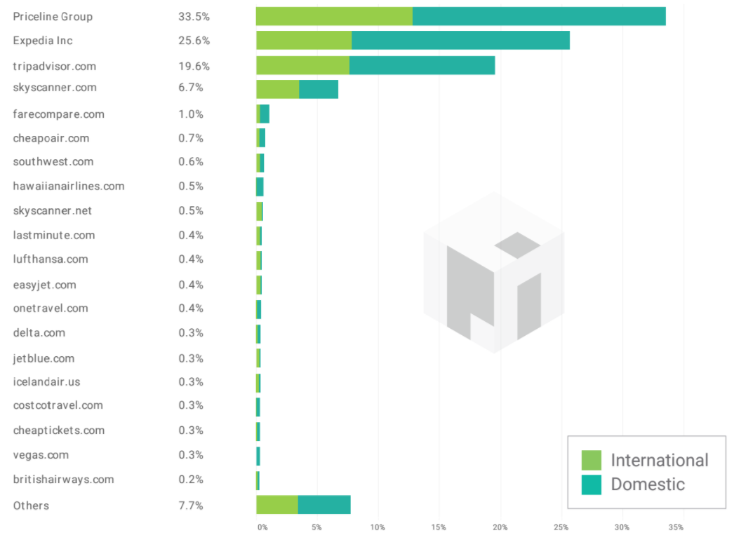
Which airline groups own the entire ‘Flights’ category?

  • Priceline Group owns 33.5% of the entire market – that’s four times more share than the entire remaining market, beyond the top 20
  • Expedia Inc owns 25.6% of the entire market
  • All ‘Others’, beyond the top 20, own a tiny 7.7% of the market
  • Airline providers can use this market share data to establish the best aggregators to resell their ‘Flights’

When combined, Expedia Inc and Priceline Group own nearly 60% of the entire US ‘Flights’ market. This is astronomical, and has created an ‘illusion of choice’ across the digital travel landscape.

  • Priceline is the 6th largest internet company by revenue ($10.64bn USD).
  • Expedia is the world’s 10th largest internet company by revenue ($8.77bn USD).

These revenue statistics just prove the success of their digital duopoly.

What can marketers and SEOs in the travel industry learn from the data about the most valuable search terms? Knowing their most valuable content gives businesses the foresight to dictate strategy.

From Pi’s trend chart, we can see that Europe and Middle Eastern flights have the highest Organic Value across the US ‘International flights’ market.

Aggregators, airlines and integrated booking sites can use this data to plan marketing activity around the most valuable flights.

Why is the online flights market so heavily dominated by just two companies?

Priceline group and Expedia own significant search real estate, and dominate the flights industry.

We can’t know exactly how these groups achieve their success, but we can presume that each brand prioritizes search throughout the business.

What’s more, these groups have an array of interrelated digital assets, which provide greater opportunity for comprehensive link infrastructures. This would only serve to boost their presence across the search landscape.

Based on the data, we can also see that online travel agencies, aggregators and booking sites decisively outrank airlines themselves in almost all cases. So why is this?

Based on their business offering, aggregators and OTAs offer a variety of content covering all areas of the flights market.

As direct providers, airlines may have less opportunity to match this offering, which could in turn impede market share.

The full report can be downloaded from the Pi Datametrics website.


from https://searchenginewatch.com/2017/08/31/report-who-owns-the-flights-market-in-search/

source https://kateninablog.tumblr.com/post/164865271349